Mother’s Day at Crossroads
For this year’s Mother’s Day celebration at Crossroads, I had the opportunity to create a full visual experience that brought together warm spring colors, playful florals, and modern design. The goal was to make every mom feel loved, celebrated, and welcomed the moment they walked through the doors—through thoughtful, cohesive branding across every touchpoint of the event.
Color Palette & Visual Direction
-
The branding was guided by a soft, modern spring palette:
Orange Red – vibrant and full of joy
Mauve Pink – warm and feminine
Beige – clean, soft, and grounding
-
The mood board was curated with imagery that captured the feeling of springtime renewal and modern femininity—featuring photos of blooming florals, natural textures, airy spaces, and warm tones that echoed the brand colors. The visuals helped anchor the design in a mood that felt fresh, joyful, and made for moms—balancing elegance with playful charm.
-
Tote bags, bookmarks and handouts were gifted to all mothers in attendance. The design featured hand-drawn florals and a minimal yet heartfelt message, giving moms something both beautiful and practical to take home.
-
The event was met with warm, glowing feedback from both the church team and attendees. Moms expressed how special and seen they felt, while guests appreciated the inviting and intentional design elements.
-
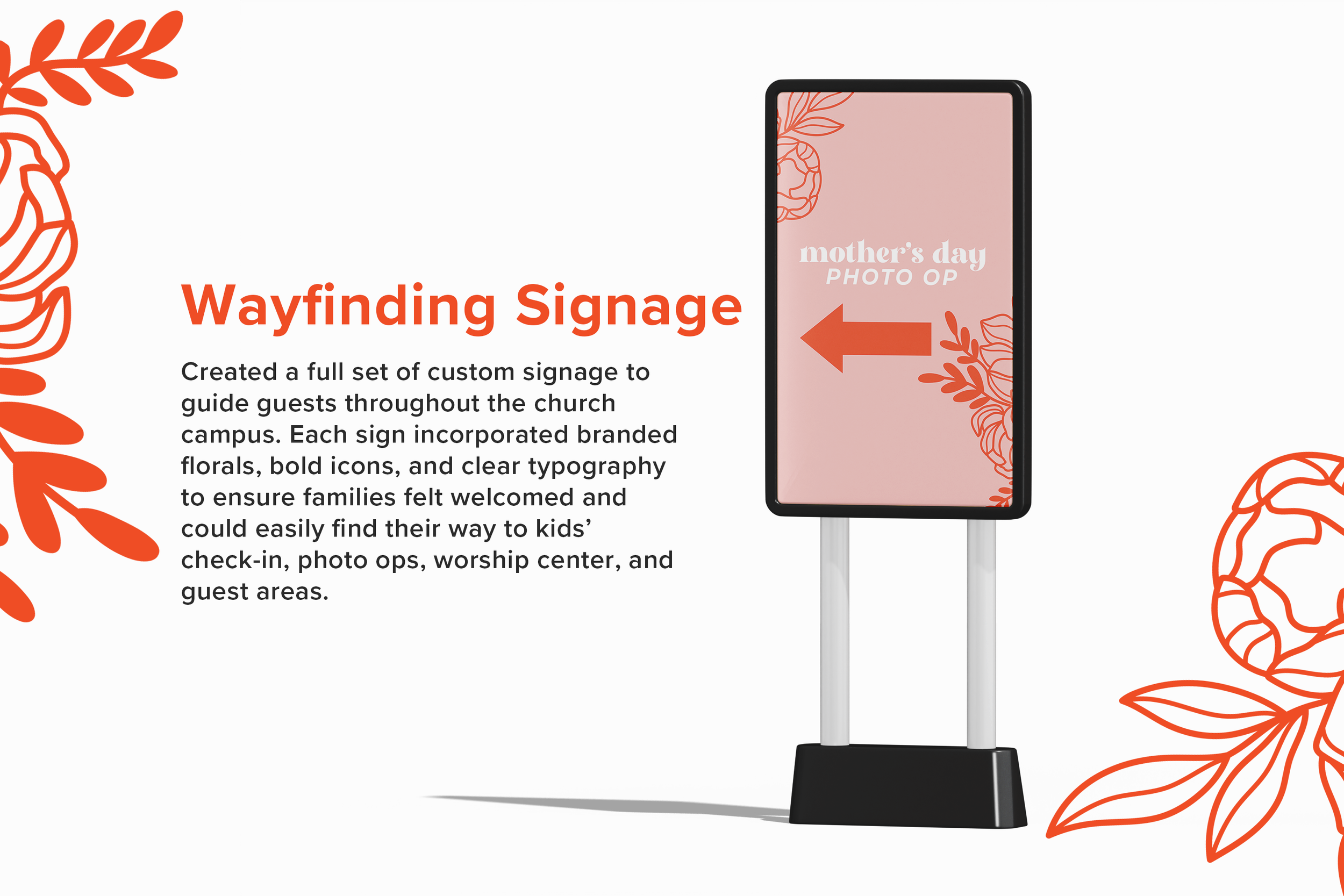
The photo booth area was designed as an interactive moment with a fresh spring backdrop, modern signage, and floral touches. Families and friends gathered here to snap pictures and create keepsake memories in a beautiful, branded space.


